
 They are more like art works than books. I'm afraid on one is gonna read them because
people will have to be really careful not to ruin them.....any way, it was a fun trip.
They are more like art works than books. I'm afraid on one is gonna read them because


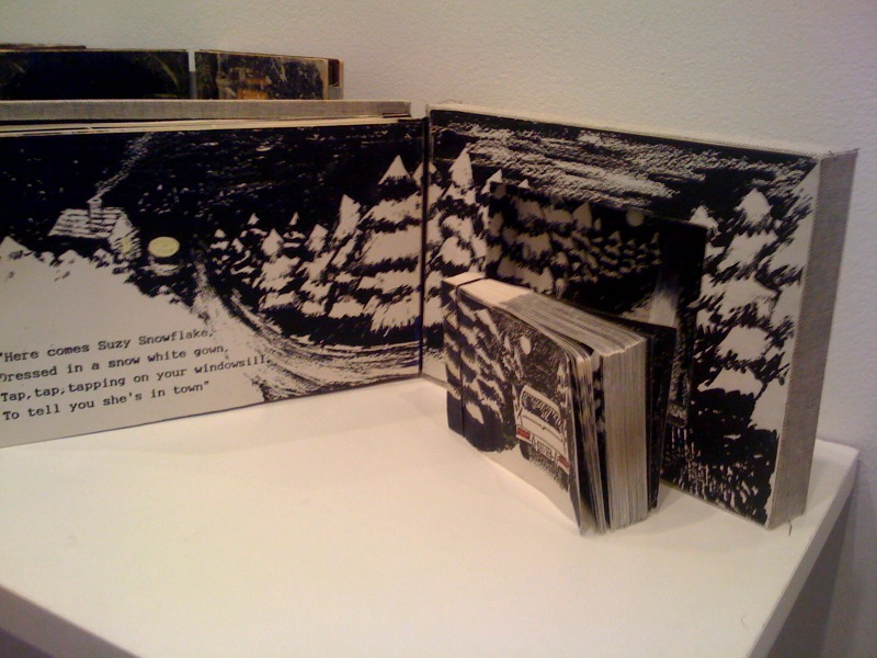


 This one was for me the most vivid and beautiful, it was just like having a book inside a book, I found it very creative and also visually appealing plus wonderfully constructed
 What I like the most about this one was how different it looked, I was wondering what was on the other side though


I enjoyed my visit to the Bunker Hill Exhibition. It indeed helped me to understand and revise my foundations of Visual Communication and to see how artist’s pens down their thoughts achieved by extreme delicacy of touch and honesty of vision.

To me, the biggest attraction of the exhibition was while I was browsing the artist book (by Laura Blacklow) on the Guatemala Stories. The depictions of the facts although looked frozen in time but were so neatly tied up that I felt as though I am watching them first hand, seated in a Time machine. It catapults the artist’s compilation of records with thought provoking ideas about the atrocities committed during the Civil war. On the whole, the means of expression was quite dynamic with the design of illustrations and narratives.

The other artist book that caught my attention was Associative Miscellany (by Annie Silverman) on the history of the Honey. Honey that is considered a natural remedy in several cultures for small illnesses was quite well known in the ancient times too. It is very rightly said in the artist’s book “A bee collecting nectar is a metaphor for packing her cells with wisdom”. The pictures alongside the text were simple and easy to understand. They communicated the message visually.


I was equally drawn to the stack of Marcia Ciro’s collection and painstaking efforts to carve a book out of Cardboard, which was a great inspiration of how vigorous, can be an art book and honing this craft.

The Book Lost in Learning equally grabbed my attention with the Old illustrations of discovery were very well supportive of the individuals representing their aura. The cylindrical books were equally amazing and it was also a novelty to handle them for the first time in my life. It was so startling to witness that in an era marred by globalized politics, culture & ecology; contemporary artists explore a world free of geographical constraints.
 2 "The Fabric Roll?" (I think there was not a label beneath this piece of artwork)
 3 "First Aid for Artists" by Kristen Hoops
 4 "Sand Battle I & II , Silent Sounds" by Laurie Alpert